|
Collie's Bestiary
Shakti has left the building.
|
 |
Click on the thumb-nails for a larger view to open up, and use your "Back" button on the menu bar to return here. Feel free to send card ideas as well! ;-)
2006.02.23
 This is from a book-making
class with Kristy that was just amazing fun! There's
enough instructional material I want to remember that I'm giving
the book its own page. Basic stuff to remember, though: Kristy's
pattern requires only two 10" regular lunch bags; some hemp
string; papers and ink in a dark, a neutral, and a light color;
and a stamp set on whatever theme you want to use. As Kristy said,
think of it not so much as scrap-booking, as a set of cards in
a theme.
This is from a book-making
class with Kristy that was just amazing fun! There's
enough instructional material I want to remember that I'm giving
the book its own page. Basic stuff to remember, though: Kristy's
pattern requires only two 10" regular lunch bags; some hemp
string; papers and ink in a dark, a neutral, and a light color;
and a stamp set on whatever theme you want to use. As Kristy said,
think of it not so much as scrap-booking, as a set of cards in
a theme.
2005.12.29
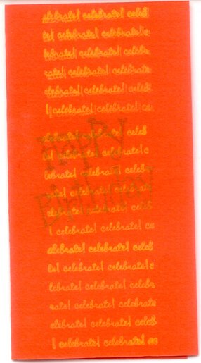
More cards soon -- I'm experimenting with making a set for an entire year, for Mom! ;)
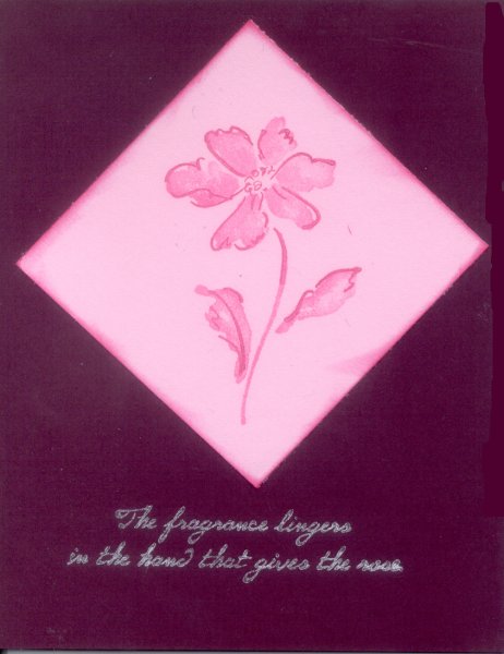 I liked the quote on this one ("the fragrance
lingers in the hand that gives the rose"), so tried to find a
suitable stamp & coloration to go with it. The quote is in
silver ink, which stood out the nicest and clearest. The flower
stamp is a two-stamp set, and the dark pink diamond is "aged"
around the edges with matching ink.
I liked the quote on this one ("the fragrance
lingers in the hand that gives the rose"), so tried to find a
suitable stamp & coloration to go with it. The quote is in
silver ink, which stood out the nicest and clearest. The flower
stamp is a two-stamp set, and the dark pink diamond is "aged"
around the edges with matching ink.
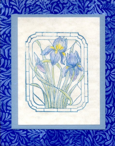 The background stamp pattern (I think it's
acanthus leaves?) covers both front and back of the dark blue
background card stock. I want try this again with a good set of
rulers to mark where to set the stamp itself, so I don't overlap
the background stamping. The current slight overlap isn't bad, but
I'd like to see how it looks with the edges of the ink properly
abutted. I'd actually like to try this again with a darker blue
background card, too. The parchment paper on the front gives
a nice textured feel, and the iris stamp (which had very thin,
delicate lines, so was a bit tricky to use) was colored in with
colored pencils.
The background stamp pattern (I think it's
acanthus leaves?) covers both front and back of the dark blue
background card stock. I want try this again with a good set of
rulers to mark where to set the stamp itself, so I don't overlap
the background stamping. The current slight overlap isn't bad, but
I'd like to see how it looks with the edges of the ink properly
abutted. I'd actually like to try this again with a darker blue
background card, too. The parchment paper on the front gives
a nice textured feel, and the iris stamp (which had very thin,
delicate lines, so was a bit tricky to use) was colored in with
colored pencils.
2005.12.11
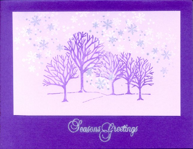 Absolutely gorgeous pattern by Michelle, originally
on even deeper and more beautiful purple papers. There's a touch
of silver ink snowflakes over the original white ink snowflakes,
which I rather like -- I think it adds a bit of depth.
Absolutely gorgeous pattern by Michelle, originally
on even deeper and more beautiful purple papers. There's a touch
of silver ink snowflakes over the original white ink snowflakes,
which I rather like -- I think it adds a bit of depth.
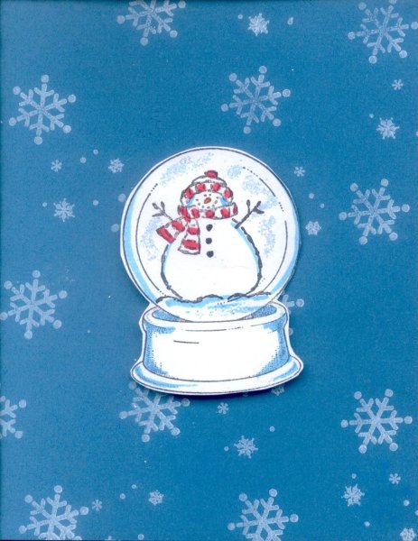 Donji's incredibly cute C-mas card! The globe
is popped up with stickies, and there's glitter in the globe's
snow. She colored in the red, and I think the snowflakes on the
background are double stamped with two different stamps. Also,
the globe snowman comes from a stamp set with a variety of
'interior' things -- the snowman, a snowkitty, a snowwoman,
etc. The snowkitty was the cutest. ;)
Donji's incredibly cute C-mas card! The globe
is popped up with stickies, and there's glitter in the globe's
snow. She colored in the red, and I think the snowflakes on the
background are double stamped with two different stamps. Also,
the globe snowman comes from a stamp set with a variety of
'interior' things -- the snowman, a snowkitty, a snowwoman,
etc. The snowkitty was the cutest. ;)
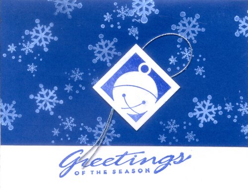 Another of Michelle's wonderful patterns. She did
a whole series of these in bright primary colors (emerald green,
this lovely blue, bright golden yellow, rich scarlet, etc.) with
different tiny matching-color stamps on top (i.e. of a jingle
bell, candle, wrapped package, etc.). The (double?) stamped
snowflakes are two different stamps, done in white ink. On the
inside, just above the fold on the left, she added a cut-out
snowflake (from a whale-tail stamp cutter) in matching color. If
the card's color was bright yellow on top of the white interior,
the tiny matching-color stamp would be yellow also, as would the
snowflake inside. I really want to try something like this next
year -- this was a really beautiful set!
Another of Michelle's wonderful patterns. She did
a whole series of these in bright primary colors (emerald green,
this lovely blue, bright golden yellow, rich scarlet, etc.) with
different tiny matching-color stamps on top (i.e. of a jingle
bell, candle, wrapped package, etc.). The (double?) stamped
snowflakes are two different stamps, done in white ink. On the
inside, just above the fold on the left, she added a cut-out
snowflake (from a whale-tail stamp cutter) in matching color. If
the card's color was bright yellow on top of the white interior,
the tiny matching-color stamp would be yellow also, as would the
snowflake inside. I really want to try something like this next
year -- this was a really beautiful set!
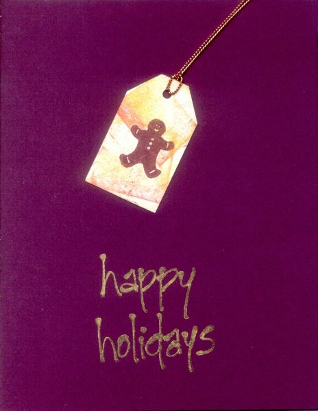
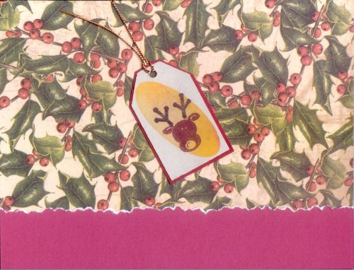 This card is me playing with one of Donji's tag
experiments, and some pre-printed C-mas paper with a carefully
torn edge. I think it has potential, although the current
design needs a less 'cartoony' art style on the tag for it to
work best. Maybe a gold stamp of a nice holiday sentiment along
the bottom too, or inside? Is the red too dark for interior text, or
would a gold pen work? Must check later.
This card is me playing with one of Donji's tag
experiments, and some pre-printed C-mas paper with a carefully
torn edge. I think it has potential, although the current
design needs a less 'cartoony' art style on the tag for it to
work best. Maybe a gold stamp of a nice holiday sentiment along
the bottom too, or inside? Is the red too dark for interior text, or
would a gold pen work? Must check later.
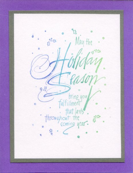 The saying on the stamp expresses a really nice
sentiment I like: "May the holiday season bring you fulfillment
that lasts throughout the coming year." The stamp was laid across
one of those multi-colored stamp pads for the blue-to-green
color shift -- note: must remember to just wiggle the stamp
a bit to dampen it, rather than actually tapping, as tapping
tends to accidentally mix the colors on the pad. Also, so I
don't forget, there's another swirly C-massy stamp I want to
try as a rainbow-colored outside-of-the-card, with this saying
on the inside.
The saying on the stamp expresses a really nice
sentiment I like: "May the holiday season bring you fulfillment
that lasts throughout the coming year." The stamp was laid across
one of those multi-colored stamp pads for the blue-to-green
color shift -- note: must remember to just wiggle the stamp
a bit to dampen it, rather than actually tapping, as tapping
tends to accidentally mix the colors on the pad. Also, so I
don't forget, there's another swirly C-massy stamp I want to
try as a rainbow-colored outside-of-the-card, with this saying
on the inside.
 Another one of Donji's tag experiments, re-used
on a card. It came out rather nice, with the very clean, sparse
layout in matching color tones. Donj made a ton of tags
this year! ;)
Another one of Donji's tag experiments, re-used
on a card. It came out rather nice, with the very clean, sparse
layout in matching color tones. Donj made a ton of tags
this year! ;)
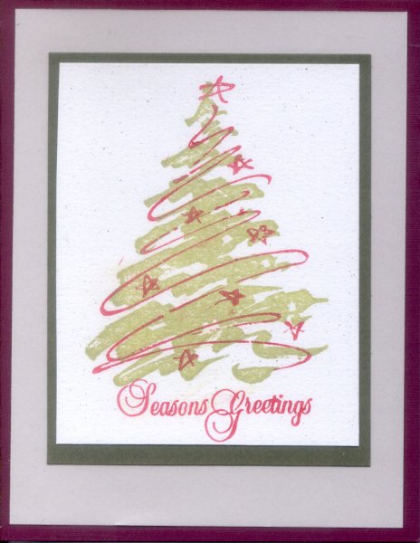 This card is the result of a nice stamp set. If I
remember correctly, Donji set up the colors, etc., for the entire
design for a demo she gave, which went really well. The card
looks really nice in-hand, too -- the red is much more rich and
vibrant than the scan shows, so it visually "pops out" strongly.
This card is the result of a nice stamp set. If I
remember correctly, Donji set up the colors, etc., for the entire
design for a demo she gave, which went really well. The card
looks really nice in-hand, too -- the red is much more rich and
vibrant than the scan shows, so it visually "pops out" strongly.
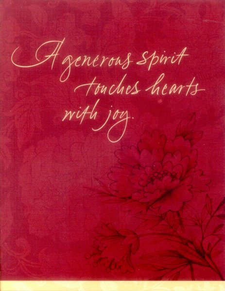 A "store-bought" card, but it's pretty and I
really like the saying, so I'm recording it here. I'd like to
find this saying in a nice cursif stamp. Must remember how nice a
bit of texturing works underneath even the simplest corner pattern
also.
A "store-bought" card, but it's pretty and I
really like the saying, so I'm recording it here. I'd like to
find this saying in a nice cursif stamp. Must remember how nice a
bit of texturing works underneath even the simplest corner pattern
also.
2005.11
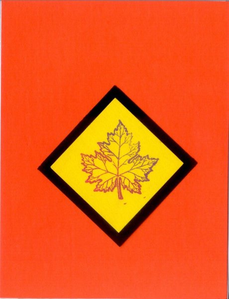
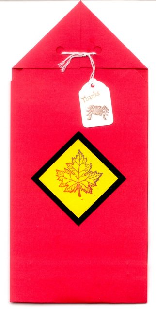
 Orange and red leaf stamps -- got the idea from
one of Kristy's lovely patterns. Donji made the tag as an example
with a whale-tail cutter, a double-stamp, and some smudging.
Orange and red leaf stamps -- got the idea from
one of Kristy's lovely patterns. Donji made the tag as an example
with a whale-tail cutter, a double-stamp, and some smudging.
 More playing with the lovely fall colors and leaves.
Couldn't decide which little stamp to use... so used them all. ;)
More playing with the lovely fall colors and leaves.
Couldn't decide which little stamp to use... so used them all. ;)
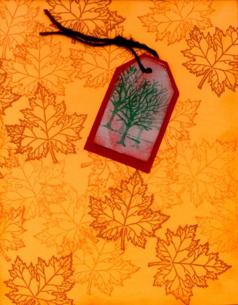
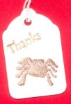
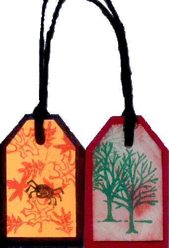 Some neat tags. I think Donji made both patterns,
and she made a whole bunch of each of them -- you can see the
tree tag used above on the first card for this date. The spider
tag was helped along by Kristy's class with all the lovely autumn
leaves, I know. ;)
Some neat tags. I think Donji made both patterns,
and she made a whole bunch of each of them -- you can see the
tree tag used above on the first card for this date. The spider
tag was helped along by Kristy's class with all the lovely autumn
leaves, I know. ;)
2005.10
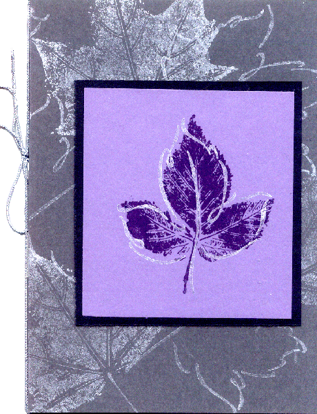 All of the ones shown here for Hallowe'en are
Kristy's lovely patterns, such as this card. In person this is
stunning, and is my absolute favorite -- lovely deep muted
purples, silver ink, leaves on front and back, and a silver
cord. Just beautiful.
All of the ones shown here for Hallowe'en are
Kristy's lovely patterns, such as this card. In person this is
stunning, and is my absolute favorite -- lovely deep muted
purples, silver ink, leaves on front and back, and a silver
cord. Just beautiful.
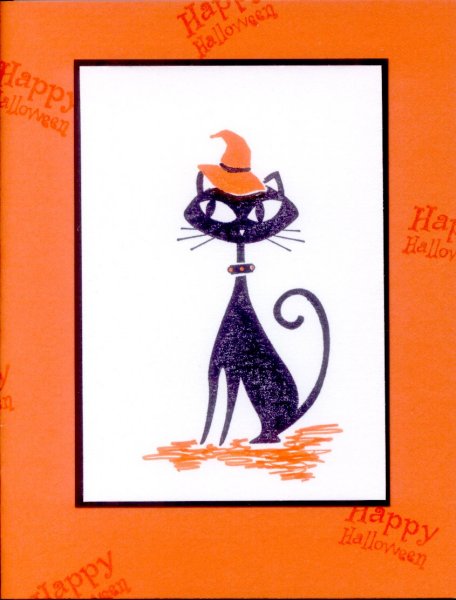 This is a cute one. We put a little piece of paper
over the top of the kitty stamp to keep its head unstamped, then
used another stamp to create the witch's hat on its head. Then we
just used magic markers to do the coloring-in. Donji inked in a
little black mousie by the feet of hers. You can't see it in the
scan, but the white paper is very cool -- it sparkles! ;)
This is a cute one. We put a little piece of paper
over the top of the kitty stamp to keep its head unstamped, then
used another stamp to create the witch's hat on its head. Then we
just used magic markers to do the coloring-in. Donji inked in a
little black mousie by the feet of hers. You can't see it in the
scan, but the white paper is very cool -- it sparkles! ;)
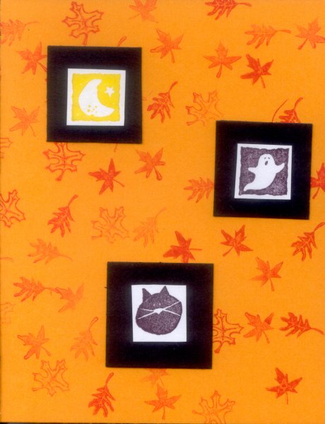
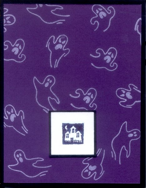 The ghosties are part of a cute little Hallowe'en
set. Also, you can't tell here, but the white square the house
is stamped on is more of that nifty sparkly paper! ;)
The ghosties are part of a cute little Hallowe'en
set. Also, you can't tell here, but the white square the house
is stamped on is more of that nifty sparkly paper! ;)
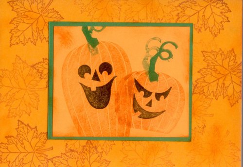 Orange and red leaf stamps all over the cardstock,
front and back, make a really lovely design. The pumpkins are
double stamped to give them a slightly faded, ghostly look.
Orange and red leaf stamps all over the cardstock,
front and back, make a really lovely design. The pumpkins are
double stamped to give them a slightly faded, ghostly look.
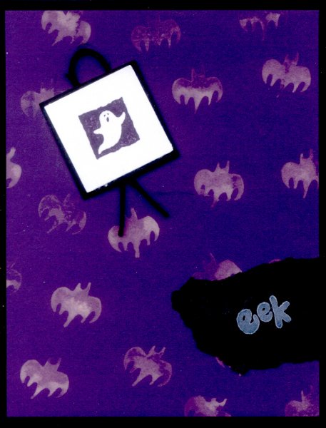 The ghosts were neat -- they're made with
bleach! It 'stained' the paper nicely on the double stamp, but
remember to clean the stamp thoroughly afterward. The
'eek' stamp is on a torn piece of paper added on top, and it
matters if you tear towards or away from you. Also, there's a
little bit of black cord behind the white & black framed
ghost stamp add-on, to make it "pop up."
The ghosts were neat -- they're made with
bleach! It 'stained' the paper nicely on the double stamp, but
remember to clean the stamp thoroughly afterward. The
'eek' stamp is on a torn piece of paper added on top, and it
matters if you tear towards or away from you. Also, there's a
little bit of black cord behind the white & black framed
ghost stamp add-on, to make it "pop up."
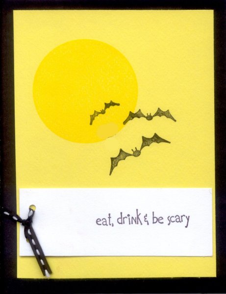 The moon wasn't a regular stamp, but
rather hand-made. The ribbon's holes only go through the white
section. The bats were all double-stamped -- once on scrap paper,
once on the card, to make it a softer black.
The moon wasn't a regular stamp, but
rather hand-made. The ribbon's holes only go through the white
section. The bats were all double-stamped -- once on scrap paper,
once on the card, to make it a softer black.
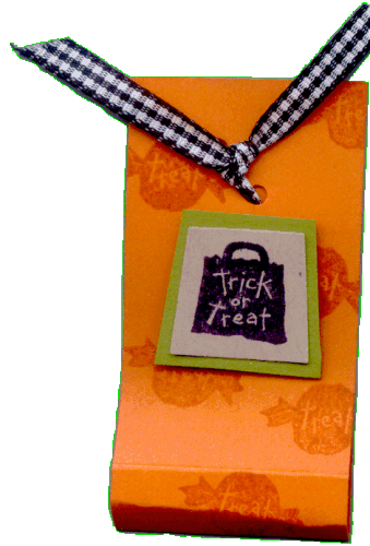 A cute little wrapper for one of those little
single chocolates. There's a whale-tail stamp for the stamped
design, which has a stick-on to make it 3D. The top has two
tiny holes punched for the tie.
A cute little wrapper for one of those little
single chocolates. There's a whale-tail stamp for the stamped
design, which has a stick-on to make it 3D. The top has two
tiny holes punched for the tie.
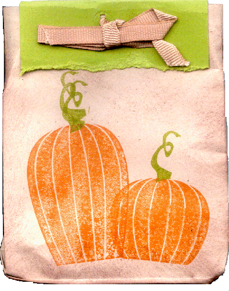 A nifty candy bag made out of a regular brown
letter envelope. The envelope was sealed, then both sides and
"bottom" folded strongly over with the bone knife. The "top"
(actually the other end) is then cut off and the envelope gently
blown open. After carefully working all the folds so the bag
ends up looking like a grocery bag, we stamped it and "aged"
the bag with a sponge and brown ink. Then the green closer gets
"torn" and laid over the top. Punch two holes for the ribbon,
then lace and tie into a bow.
A nifty candy bag made out of a regular brown
letter envelope. The envelope was sealed, then both sides and
"bottom" folded strongly over with the bone knife. The "top"
(actually the other end) is then cut off and the envelope gently
blown open. After carefully working all the folds so the bag
ends up looking like a grocery bag, we stamped it and "aged"
the bag with a sponge and brown ink. Then the green closer gets
"torn" and laid over the top. Punch two holes for the ribbon,
then lace and tie into a bow.
2005.08.09
 First some cards and things from a class I recently
took, and then a collection of cards from previous classes which
I'd not archived here yet. Fortunately the class director is both
blessed with a really nice sense of artistic style (as all her
class patterns which I've archived here clearly demonstrate),
and kind enough to send me photos of the cards I'd not archived
due to mailing them out to folks already -- thanks, Kristy! ;)
First some cards and things from a class I recently
took, and then a collection of cards from previous classes which
I'd not archived here yet. Fortunately the class director is both
blessed with a really nice sense of artistic style (as all her
class patterns which I've archived here clearly demonstrate),
and kind enough to send me photos of the cards I'd not archived
due to mailing them out to folks already -- thanks, Kristy! ;)
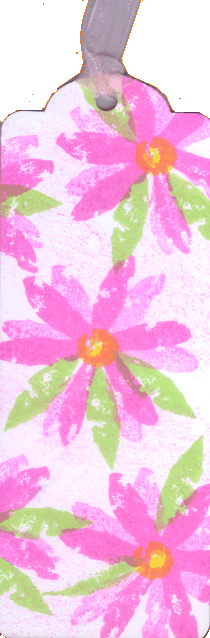
 The above bookmark was created from a pre-cut
paper shape, with a bit of sheer pink ribbon tied to the top. The
effect of the flowers was created by stamping once, turning
slightly, and stamping again. Leaves and the flower center were
different stamps. The little box was also from a pre-cut form,
covered with a large, simple "screen door" stamp (which was
stamped once on scrap paper, then on the box) for texture. The
flowers were stamped three times in a row without re-inking,
while the flower outline was re-inked each time.
The above bookmark was created from a pre-cut
paper shape, with a bit of sheer pink ribbon tied to the top. The
effect of the flowers was created by stamping once, turning
slightly, and stamping again. Leaves and the flower center were
different stamps. The little box was also from a pre-cut form,
covered with a large, simple "screen door" stamp (which was
stamped once on scrap paper, then on the box) for texture. The
flowers were stamped three times in a row without re-inking,
while the flower outline was re-inked each time.
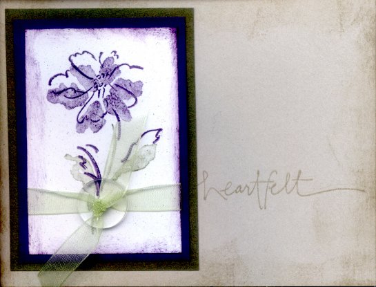 This card has a slightly "dirty" look in the scan,
but looks really nice in reality. There's a clear button (one of
several shapes and sizes available, which are dyeable too) tied
onto the card with another bit of sheer ribbon. Again, the actual
flower and leaf shapes were pre-stamped on scrap paper to soften
them, while the outline was not. A sponge was used to smudge the
edges of the paper. Also, next time I should be sure the word
stamp (i.e. "heartfelt") goes off the right edge, so the flower
papers aren't quite so close to the left-hand side of the card.
This card has a slightly "dirty" look in the scan,
but looks really nice in reality. There's a clear button (one of
several shapes and sizes available, which are dyeable too) tied
onto the card with another bit of sheer ribbon. Again, the actual
flower and leaf shapes were pre-stamped on scrap paper to soften
them, while the outline was not. A sponge was used to smudge the
edges of the paper. Also, next time I should be sure the word
stamp (i.e. "heartfelt") goes off the right edge, so the flower
papers aren't quite so close to the left-hand side of the card.
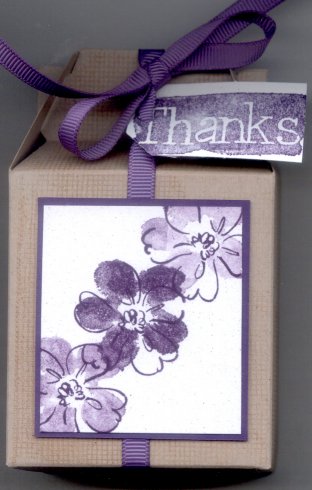
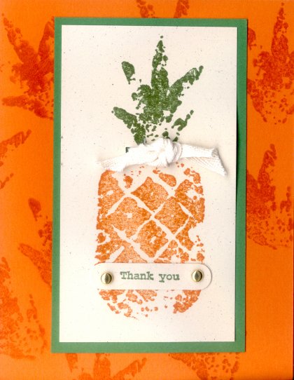 There're lots of add-on things on this card --
the two little brads, the bit of cotton cloth ribbon/tye (note:
cotton can also be stamped, using special ink) -- and the same
pre-stamping effect was used for the pineapple itself. The
"thank you" paper was cut with a shaped stamp-out cutter,
and the orange background has orange stamps of the "leaves"
(to give it a bit of texture) both front and back. Note: texture
is important for a "finished" look!
There're lots of add-on things on this card --
the two little brads, the bit of cotton cloth ribbon/tye (note:
cotton can also be stamped, using special ink) -- and the same
pre-stamping effect was used for the pineapple itself. The
"thank you" paper was cut with a shaped stamp-out cutter,
and the orange background has orange stamps of the "leaves"
(to give it a bit of texture) both front and back. Note: texture
is important for a "finished" look!
A quick note: the talented woman who gives the stamping classes does occasionally have space for more in her classes. If you live somewhere around the South Bay area in California, and you'd like some inexpensive, easy, friendly, and very nice stamping classes, let me know and I'll connect you with Kristy -- she's quite imaginative!
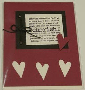 These are digital photos of cards in plastic
sleeves, of patterns from the card classes, which I forgot to
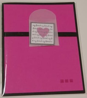
archive, as mentioned above. On this card there are three black
brads and black cord used, and the top inset is arranged so it
looks like a book, sort of. The red heart is one of the ones
stamped out below (there's a cream card base), glued on with a
little sticky button so it stands up a bit.
These are digital photos of cards in plastic
sleeves, of patterns from the card classes, which I forgot to
archive, as mentioned above. On this card there are three black
brads and black cord used, and the top inset is arranged so it
looks like a book, sort of. The red heart is one of the ones
stamped out below (there's a cream card base), glued on with a
little sticky button so it stands up a bit.
 I actually did this one in navy blue & gold,
since I intended to send it to my cousin Cameron, and those were
his high school colors. I also used "Congratulations" instead of
"Good luck." The little rice paper circle framed in metal is
on a sticky button so it stands up a bit over the silver cord,
but still holds them firmly in place.
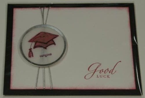
I actually did this one in navy blue & gold,
since I intended to send it to my cousin Cameron, and those were
his high school colors. I also used "Congratulations" instead of
"Good luck." The little rice paper circle framed in metal is
on a sticky button so it stands up a bit over the silver cord,
but still holds them firmly in place.
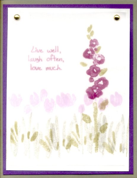 There's a sheer piece of rice paper bradded on over
the stamping. Actually, I think the front-most flower and the quote are
actually on the rice paper itself, so it's clearer.
The flowers in the background are "second-stamped," as in you stamp
once on scrap paper, then on the card, to get the softened look. The
quote is: "Live well, laugh often, love much," and I gave this one
to Bob, my sweetie. Of course. ;)
There's a sheer piece of rice paper bradded on over
the stamping. Actually, I think the front-most flower and the quote are
actually on the rice paper itself, so it's clearer.
The flowers in the background are "second-stamped," as in you stamp
once on scrap paper, then on the card, to get the softened look. The
quote is: "Live well, laugh often, love much," and I gave this one
to Bob, my sweetie. Of course. ;)
 This was a good example of how important that
finishing touch is -- in this case, just three little pink squares
in the bottom right corner. That really made the difference,
much to my surprise. Also, that's a bit of black ribbon, and
the rice paper envelope is stuck to it, with the little "note"
tucked inside it. The note was made much like the style of the
card below, and is not sealed or glued at all. The slight tilt
makes a very nice effect, I think.
This was a good example of how important that
finishing touch is -- in this case, just three little pink squares
in the bottom right corner. That really made the difference,
much to my surprise. Also, that's a bit of black ribbon, and
the rice paper envelope is stuck to it, with the little "note"
tucked inside it. The note was made much like the style of the
card below, and is not sealed or glued at all. The slight tilt
makes a very nice effect, I think.
 I don't know why, but I thought the wrapper
(corrugated with one of those paper wrinklers) was a bit
much. However, I really like the little rice-paper window,
with the word-stamp (I think I used the word "friendship")
stamped directly on it, and the pink stamp on the inside of the
card so it shows through. I think I used a little star on mine,
but I don't remember for sure.
I don't know why, but I thought the wrapper
(corrugated with one of those paper wrinklers) was a bit
much. However, I really like the little rice-paper window,
with the word-stamp (I think I used the word "friendship")
stamped directly on it, and the pink stamp on the inside of the
card so it shows through. I think I used a little star on mine,
but I don't remember for sure.
2005.07.30
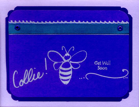 This beautiful card was from Michelle & Donji on
a Saturday where I missed our regular stamping time. It's just
beautiful! The ribbon is bradded on and there's silver ink used
around it. I think the bee was freehand! It's a gorgeous card,
with some of my absolute favorite colors, and there were personal
notes inside from all three women -- I was really touched!
This beautiful card was from Michelle & Donji on
a Saturday where I missed our regular stamping time. It's just
beautiful! The ribbon is bradded on and there's silver ink used
around it. I think the bee was freehand! It's a gorgeous card,
with some of my absolute favorite colors, and there were personal
notes inside from all three women -- I was really touched!
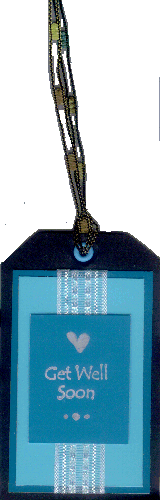 The above card arrived in a bag of home-made
goodies, with this tag stuck on the plastic cover of the top
one. It made me a bit sniffly. There's a bit of sheer ribbon
under the paper with "Get well soon" on it, and the dots and
heart are, I think, freehand again. I have the nicest friends. ;)
The above card arrived in a bag of home-made
goodies, with this tag stuck on the plastic cover of the top
one. It made me a bit sniffly. There's a bit of sheer ribbon
under the paper with "Get well soon" on it, and the dots and
heart are, I think, freehand again. I have the nicest friends. ;)
2005.06.25
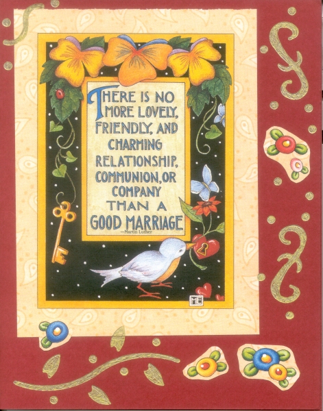 This one's a pastiche with an already existing
piece of artwork from a Sarah Englebright (sp?) desk calendar
page, to celebrate the wedding of a friend. The quote is:
"There is no more lovely, friendly, and charming relationship,
communion, or company than a good marriage. -- Martin
Luther." Admittedly, I don't care for marriage overall, but to
each their own. I added some gold ink stencils to pull the piece
together; I think it works okay! ;)
This one's a pastiche with an already existing
piece of artwork from a Sarah Englebright (sp?) desk calendar
page, to celebrate the wedding of a friend. The quote is:
"There is no more lovely, friendly, and charming relationship,
communion, or company than a good marriage. -- Martin
Luther." Admittedly, I don't care for marriage overall, but to
each their own. I added some gold ink stencils to pull the piece
together; I think it works okay! ;)
2005.05.01
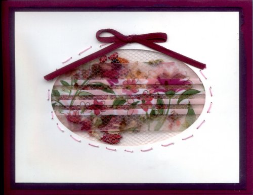 I'm archiving some patterns here that I really
like. The potpourri is in a little, glued-shut pocket of tulle,
then sewn onto the back of the card frontispiece so it shows
through the oval hole. In front of it is a stamped and colored
bit of partially transparent ribbon.
I'm archiving some patterns here that I really
like. The potpourri is in a little, glued-shut pocket of tulle,
then sewn onto the back of the card frontispiece so it shows
through the oval hole. In front of it is a stamped and colored
bit of partially transparent ribbon.
Huh, I just realized... I've been doing this for a year. My first card attempts included a Mother's Day card last year. Cool! ;)
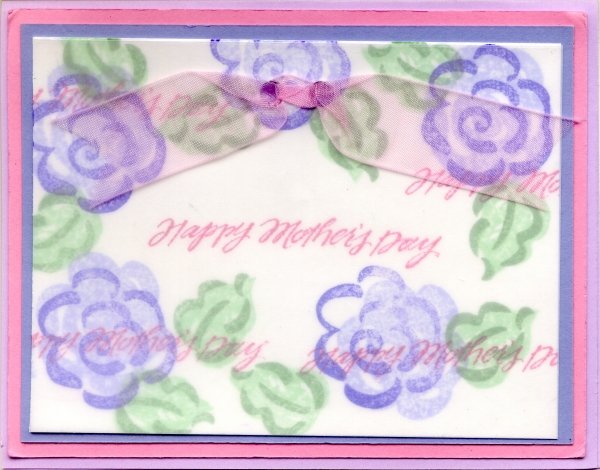 This card has a sheet of vellum over the stamping,
and has a nice, diffused look that doesn't really show in the
flattening of a scan. Considering how softly colored the chalk
inks are, though, I think next time I'll put at least the "Happy
Mother's Day" stamp that appears in the middle of the flowers
on top of the vellum.
This card has a sheet of vellum over the stamping,
and has a nice, diffused look that doesn't really show in the
flattening of a scan. Considering how softly colored the chalk
inks are, though, I think next time I'll put at least the "Happy
Mother's Day" stamp that appears in the middle of the flowers
on top of the vellum.
2005.04.??
 This tri-fold design pattern I got from a stamping
class I took. The original was very pink and cute and faux French,
so I experimented with the card pattern to see if I could get
it to work with some of the stamps I had. I'm pleased with the
results, so the answer seems to be "yes." ;)
This tri-fold design pattern I got from a stamping
class I took. The original was very pink and cute and faux French,
so I experimented with the card pattern to see if I could get
it to work with some of the stamps I had. I'm pleased with the
results, so the answer seems to be "yes." ;)
 For future use: use a large, non intricate
stamp for the "seal," and use the embossing black ink so it's
easier to color in later. The ribbon should be glued between the
trifold and the background sheet, and should have the short end
on the viewer's left. Also, the trifold worked out to a nice 8"
x 5", and should be cut to be sure there's overlap and
the top and bottom edges are even.
For future use: use a large, non intricate
stamp for the "seal," and use the embossing black ink so it's
easier to color in later. The ribbon should be glued between the
trifold and the background sheet, and should have the short end
on the viewer's left. Also, the trifold worked out to a nice 8"
x 5", and should be cut to be sure there's overlap and
the top and bottom edges are even.
2004.11.07
 I seem to be on a roll here; my sweetie asked
me to make some "thank you!" cards for his dad, just like I'd
done for my mom -- hopefully they'll be enjoyed just as much. I
decided to see if I could re-use some of the things we'd had fun
with earlier work, and ended up with four card patterns for him.
I seem to be on a roll here; my sweetie asked
me to make some "thank you!" cards for his dad, just like I'd
done for my mom -- hopefully they'll be enjoyed just as much. I
decided to see if I could re-use some of the things we'd had fun
with earlier work, and ended up with four card patterns for him.
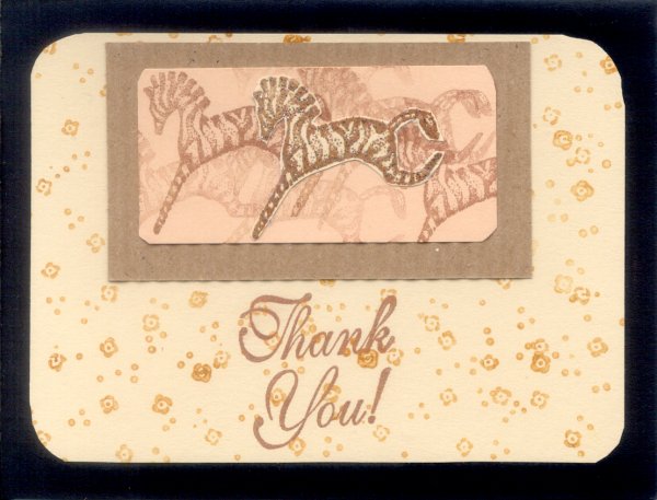 The two new designs shown here were created by some
wonderful friends who were kind enough to share. This one is hard
to see, but has a sparkley embossed zebra superimposed on top of
the others. The other two designs used were the embossed cream
card created for my mother's gift (shown below in 2004.10.10),
and the lovely gift-wrappers we created for my birthday.
The two new designs shown here were created by some
wonderful friends who were kind enough to share. This one is hard
to see, but has a sparkley embossed zebra superimposed on top of
the others. The other two designs used were the embossed cream
card created for my mother's gift (shown below in 2004.10.10),
and the lovely gift-wrappers we created for my birthday.
 After cutting to an appropriate size, I glued the
lovely stamp work onto a nice white card with "Thank You!" stamped
on the inside, so they'd be easy to write on. I must say, having
a group to work with really makes a huge difference in
both the creativity and the fun quotient. ;)
After cutting to an appropriate size, I glued the
lovely stamp work onto a nice white card with "Thank You!" stamped
on the inside, so they'd be easy to write on. I must say, having
a group to work with really makes a huge difference in
both the creativity and the fun quotient. ;)
2004.10.24
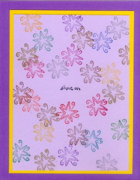 I found this stamp -- the spirally star and the
phrase "Shine on" -- and for some reason it just reminded me
strongly of my sweetie. So, this card is for him -- rainbow of
colors and all. ;)
I found this stamp -- the spirally star and the
phrase "Shine on" -- and for some reason it just reminded me
strongly of my sweetie. So, this card is for him -- rainbow of
colors and all. ;)
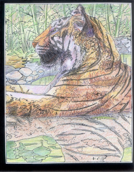 This was almost an accident -- a good friend
had this huge new stamp which was just an outline of the lovely
color graphic on the wooden handle. Just for fun I tried it out,
to see how well it would transfer. It wasn't too bad... so after
I did the following card, I spent a pleasant and relaxing hour
idly coloring the tiger stamp in just like the graphic looked,
just to see if it'd come out okay. I think it did!
This was almost an accident -- a good friend
had this huge new stamp which was just an outline of the lovely
color graphic on the wooden handle. Just for fun I tried it out,
to see how well it would transfer. It wasn't too bad... so after
I did the following card, I spent a pleasant and relaxing hour
idly coloring the tiger stamp in just like the graphic looked,
just to see if it'd come out okay. I think it did!
 Another large stamp that came out far nicer than I
expected. Woot! On the inside I added a simple face-page and the
stamp "May every day be a celebration of the heart!"
Another large stamp that came out far nicer than I
expected. Woot! On the inside I added a simple face-page and the
stamp "May every day be a celebration of the heart!"
2004.10.10
 My mom did something really, really thoughtful
for my birthday, which I greatly appreciated. I wanted to say
thank you in some way she'd enjoy, so I made up a small package
of cards for her. Hope she likes 'em. ;) [Update 10/23:
she sure does -- yay!]
My mom did something really, really thoughtful
for my birthday, which I greatly appreciated. I wanted to say
thank you in some way she'd enjoy, so I made up a small package
of cards for her. Hope she likes 'em. ;) [Update 10/23:
she sure does -- yay!]
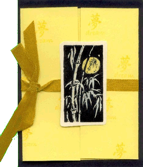
 The package consisted of 16 cards; four of each
pattern I used. I repeated the paint chip bamboo I'd done before,
which is shown below, and I used some pretty embossed postcards
I'd found some time ago to make a nice, formal looking card.
The package consisted of 16 cards; four of each
pattern I used. I repeated the paint chip bamboo I'd done before,
which is shown below, and I used some pretty embossed postcards
I'd found some time ago to make a nice, formal looking card.
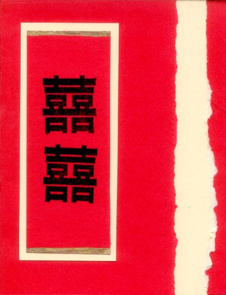 The Double Happiness symbol is usually used for
newly weds, I think, but I figured mom would forgive me that. Red
is the color of life and good fortune in Chinese symbology,
from what I've read, and the double happiness symbols are to
ensure prosperity and good fortune.
The Double Happiness symbol is usually used for
newly weds, I think, but I figured mom would forgive me that. Red
is the color of life and good fortune in Chinese symbology,
from what I've read, and the double happiness symbols are to
ensure prosperity and good fortune.
2004.10.03
 I like gift-giving -- it's a huge amount of fun for
me. This year for my birthday I decided to throw a party myself,
and I'd give away a small bag of cute little "tchatchkees," or
"tiny treasures," covered with a nice stamped paper wrapper, for
everyone who came.
I like gift-giving -- it's a huge amount of fun for
me. This year for my birthday I decided to throw a party myself,
and I'd give away a small bag of cute little "tchatchkees," or
"tiny treasures," covered with a nice stamped paper wrapper, for
everyone who came.
 Two wonderful friends helped me put all this
together -- thank you so much, Michelle & Donji! I had red,
yellow, orange, and black wrappers, with the cellophane baggie
of tchatchkees taped within the triangle formed. There was also
a little hand-made book within each one (also with red, yellow,
orange, or black covers) describing some Halloween lore and the
symbolism of the little toys within. Click on the thank you tag
below for the text of the little booklet.
Two wonderful friends helped me put all this
together -- thank you so much, Michelle & Donji! I had red,
yellow, orange, and black wrappers, with the cellophane baggie
of tchatchkees taped within the triangle formed. There was also
a little hand-made book within each one (also with red, yellow,
orange, or black covers) describing some Halloween lore and the
symbolism of the little toys within. Click on the thank you tag
below for the text of the little booklet.
 I was a little worried about how the party and
tiny treasures would be seen, since this was the first time
I'd ever done anything like this. I shouldn't have worried --
the party was simply wonderfully fun, and the tchatchkees were
extremely well received! I had a great time, and we're quite
sure we must do this again soon -- parties are fun! ;)
I was a little worried about how the party and
tiny treasures would be seen, since this was the first time
I'd ever done anything like this. I shouldn't have worried --
the party was simply wonderfully fun, and the tchatchkees were
extremely well received! I had a great time, and we're quite
sure we must do this again soon -- parties are fun! ;)
2004.08.13
 Yes, it was Friday the 13th, but I've always had
good luck on that day, contrarily enough. The backgrounds on
both these cards were done with damp sponges and ink, with cut
paper and/or stamped overlays. It made for a nice soft swirly
effect.
Yes, it was Friday the 13th, but I've always had
good luck on that day, contrarily enough. The backgrounds on
both these cards were done with damp sponges and ink, with cut
paper and/or stamped overlays. It made for a nice soft swirly
effect.
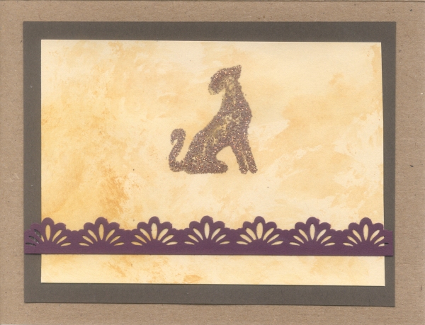
 Interestingly, the glitter leopard above didn't
"melt" properly, due to the dampness of the paper I'd just been
swiping with ink, but I still like it. The tassels & beads
on this card to the left were fun to touch up and add as well.
Interestingly, the glitter leopard above didn't
"melt" properly, due to the dampness of the paper I'd just been
swiping with ink, but I still like it. The tassels & beads
on this card to the left were fun to touch up and add as well.
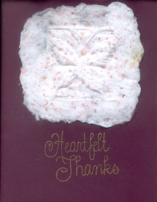 This card was fun. It has some hand-made pressed
paper decoration at the top, which I enjoyed learning how to
do. The paper also had tiny flecks of brass (or something) in it,
and there's a butterfly impressed into the paper. Paper making is
surprisingly easy to do -- just messy!
This card was fun. It has some hand-made pressed
paper decoration at the top, which I enjoyed learning how to
do. The paper also had tiny flecks of brass (or something) in it,
and there's a butterfly impressed into the paper. Paper making is
surprisingly easy to do -- just messy!
2004.07.07
 A dear friend invited me over for some
card making, and I ended up with two birthday cards for two other
good friends. Serendipity is always such a pleasure! We're going
to make a habit of this, I hope -- I really enjoy the gestalt
of working with friends. It makes not just the entire process
more fun, but you can get good ideas from each other. Cool! ;)
A dear friend invited me over for some
card making, and I ended up with two birthday cards for two other
good friends. Serendipity is always such a pleasure! We're going
to make a habit of this, I hope -- I really enjoy the gestalt
of working with friends. It makes not just the entire process
more fun, but you can get good ideas from each other. Cool! ;)
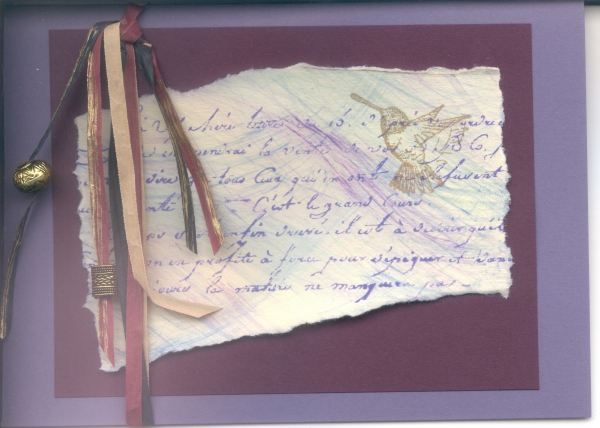
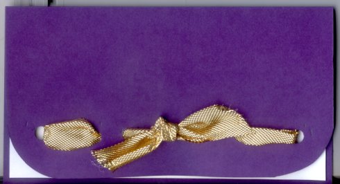
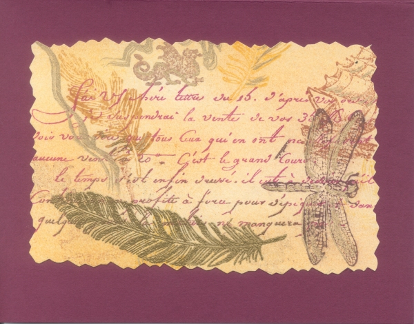 The card on the right was made by smearing pastels
across the damp ink, and the butterfly was cut out and stuck on
with dots. This card on the left was a whole bunch of stamps,
topped off with an embossed gold feather stamp. Then that piece
was cut out with ragged-edged scissors, to get an old parchment
effect.
The card on the right was made by smearing pastels
across the damp ink, and the butterfly was cut out and stuck on
with dots. This card on the left was a whole bunch of stamps,
topped off with an embossed gold feather stamp. Then that piece
was cut out with ragged-edged scissors, to get an old parchment
effect.
2004.05.06
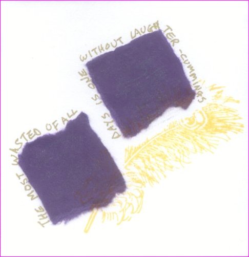 Sometimes you've just got to go with the
flow. After a math error caused me to end up with three
smaller-than-expected cards, I experimented, for fun and so as to
not waste the paper. Each card has a different phrase on it:
Sometimes you've just got to go with the
flow. After a math error caused me to end up with three
smaller-than-expected cards, I experimented, for fun and so as to
not waste the paper. Each card has a different phrase on it:
"Nothing is so contagious as enthusiasm." -- Samuel Taylor Coleridge
"We never outgrow our love for presents." -- Alexandra Stoddard
"The most wasted of all days is one without laughter." -- e. e. cummings
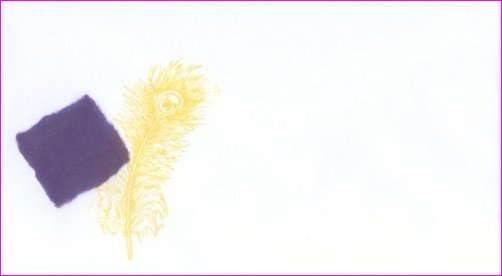 Once they were done I decided I might as well
make matching envelopes too. Necessity is a mother! ;)
Once they were done I decided I might as well
make matching envelopes too. Necessity is a mother! ;)
2004.05.02
 The first card I made on my own (I'd made one previously
at a "stamping party"). It's rough, but the textures came out really
nicely.
The first card I made on my own (I'd made one previously
at a "stamping party"). It's rough, but the textures came out really
nicely.
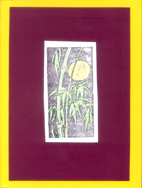
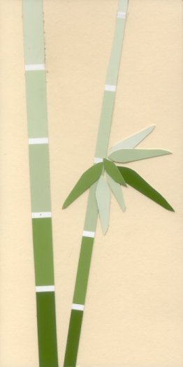 The idea for this one came from a book on card-making. The
bamboo stalks are those "paint chips," or color swatches on thin papers,
which you can find in paint stores.
The idea for this one came from a book on card-making. The
bamboo stalks are those "paint chips," or color swatches on thin papers,
which you can find in paint stores.
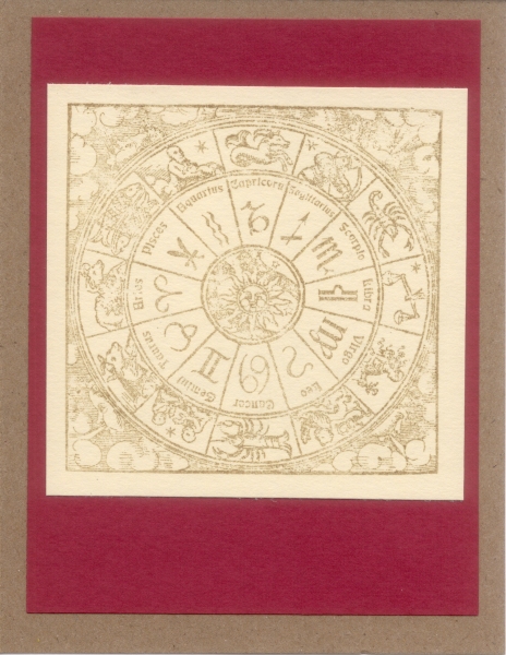
I made up the stem and leaf arrangement based on a Japanese-style scroll painting I did many years ago. Came out okay, I think.
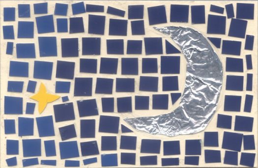 Speaking of paint chips... the mosaic
'stones' are all paint chips, while the moon is of aluminum
foil. It was a Mother's Day card, and part of the interior
message read:
Speaking of paint chips... the mosaic
'stones' are all paint chips, while the moon is of aluminum
foil. It was a Mother's Day card, and part of the interior
message read:
In astrology the new moon symbolizes all that is receptive in humankind, the emotional life, and the ability to react. The key word is personality, the inner individual's outer shell that is continually formed and changed by what she experiences... the Mother.
from Carl G. Liungman's "Dictionary of Symbols"
And on the back of each card is a little tiny version of this still-in-development graphic:
Copyright © 1992-2026 B. "Collie" Collier. All rights reserved.
Web site design & maintenance: Laughing Collie Productions
Contact the web administrator for any technical problems